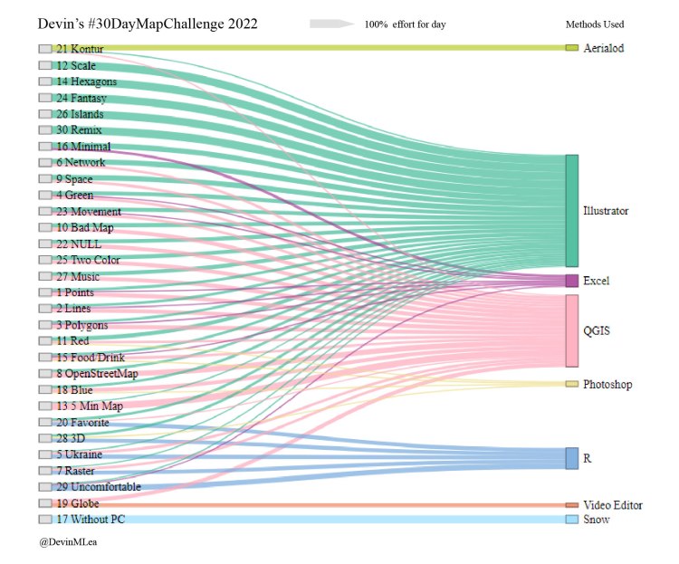
Every November for the past few years, map geeks around the world have shown off their skills on social media by making and posting maps based on various themes. You can see this year’s (and past years) themes here: https://30daymapchallenge.com
Below are maps I created for #30DayMapChallenge in November 2022 and posted on Twitter.
Curious how I made a map? You can find project details and code on my Github: https://github.com/devinmlea/MapsAndCode/tree/main/30DayMapChallenge2022
FYI: I release most maps on my website under a Creative Commons Attribution + Noncommercial + Share Alike license (look for the license on the map). If you see this symbol, it means you can take these maps and reshare them or reproduce/remix them for noncommercial purposes, but please attribute me if you do so, or contact me if you wish to use them for commercial purposes.
Day 1: Points
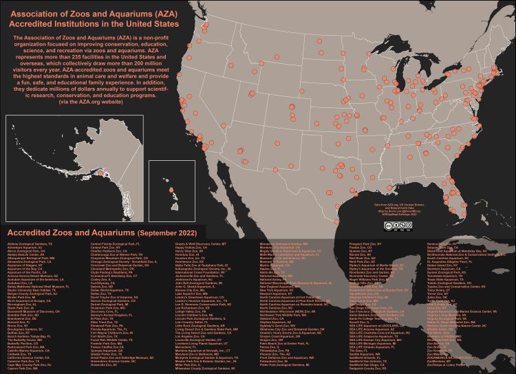
Tools Used:
- Microsoft Excel, QGIS, Adobe Illustrator
Day 2: Lines
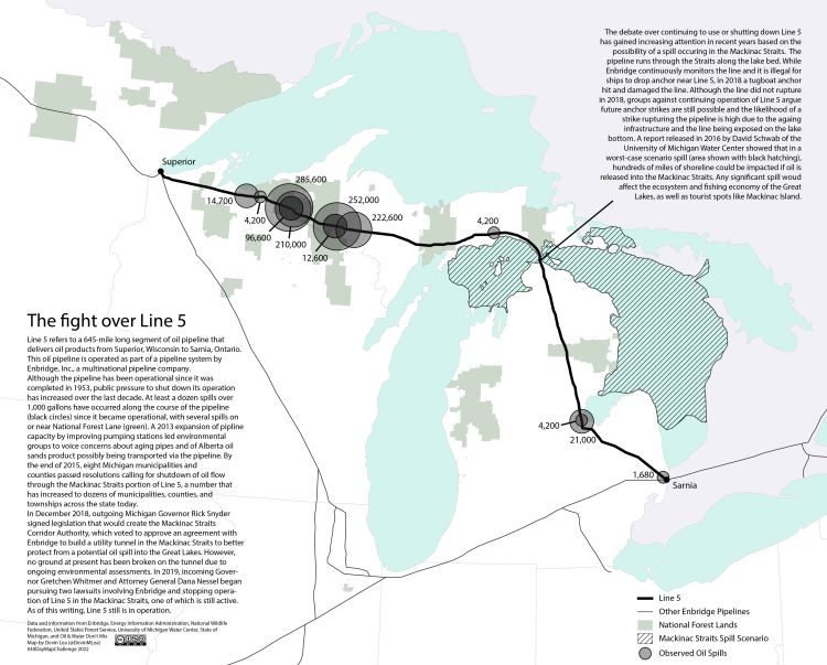
Tools Used:
- Microsoft Excel, QGIS, Adobe Illustrator
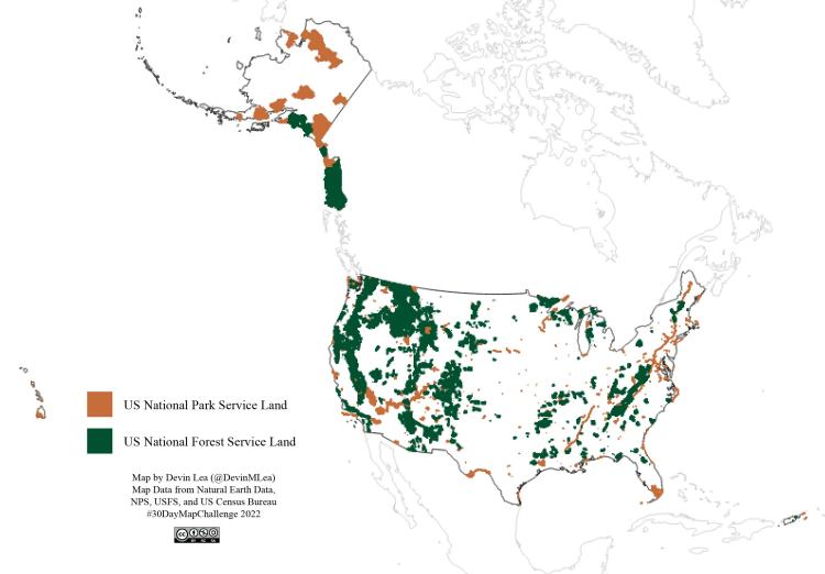
Day 3: Polygons
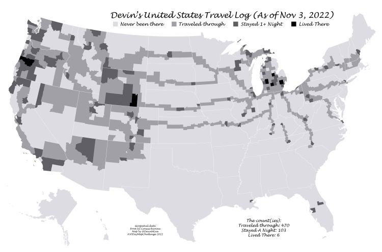
Tools Used:
- Microsoft Excel, QGIS, Adobe Illustrator
Day 4: Green
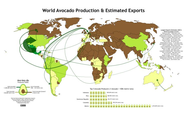
Tools Used:
- Microsoft Excel, QGIS, Adobe Illustrator
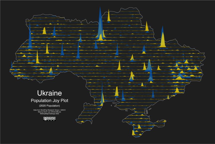
Day 5: Ukraine
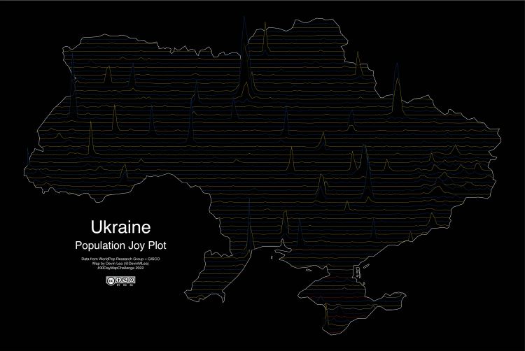
Tools Used:
- QGIS, R, Adobe Illustrator
Day 6: Network
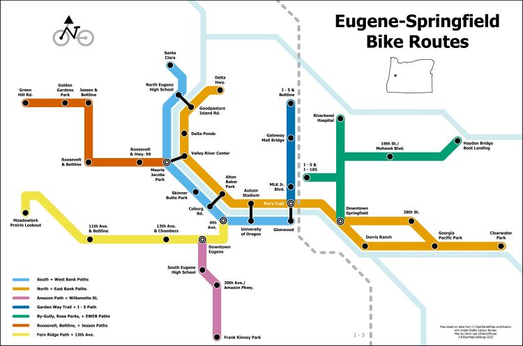
Tools Used:
- QGIS, Adobe Illustrator
Day 7: Raster
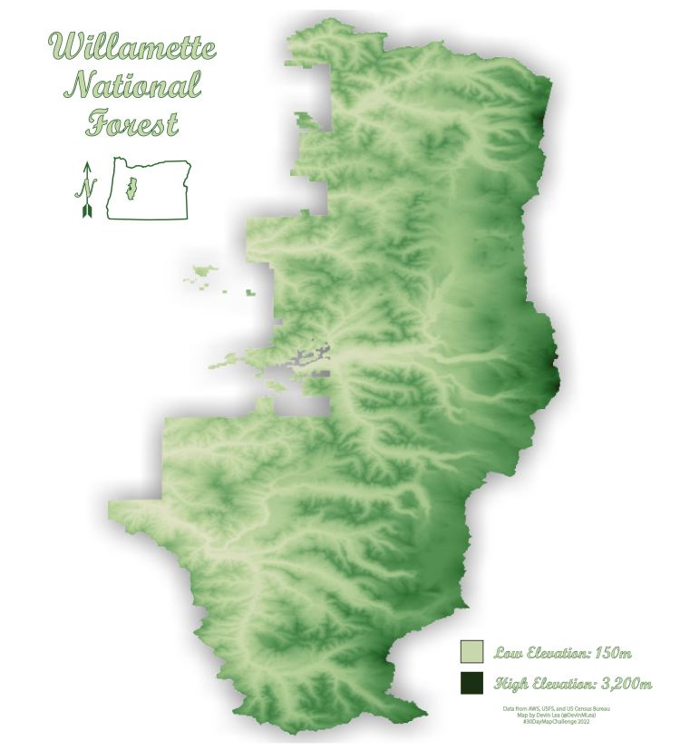
Tools Used:
- QGIS, R, Adobe Illustrator
Day 8: OpenStreetMap
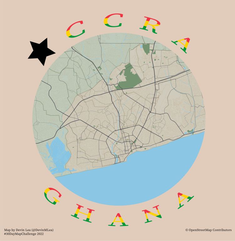
Tools Used:
- QGIS, Adobe Illustrator
Day 9: Space
Tools Used:
- QGIS, Adobe Illustrator
Day 10: A Bad Map
Tools Used:
- QGIS, Adobe Illustrator
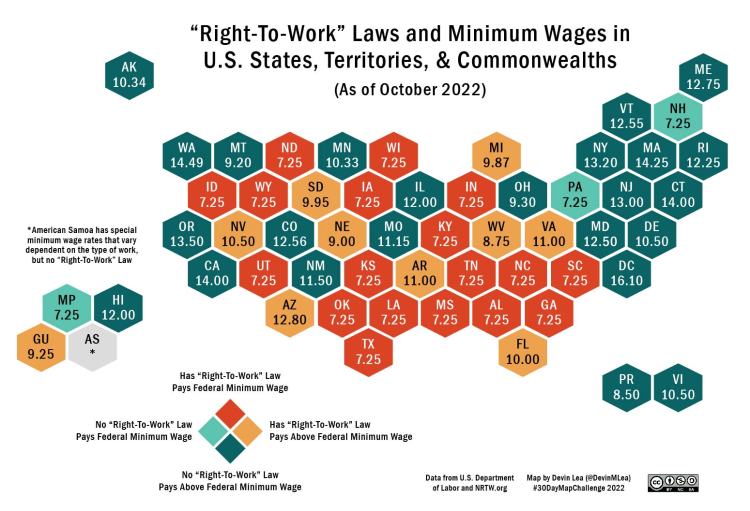
Day 11: Red
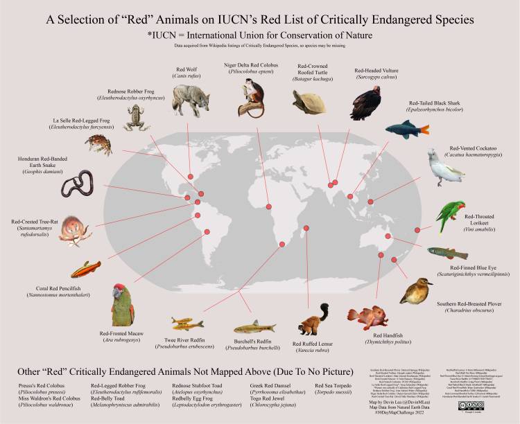
Tools Used:
Microsoft Excel, Adobe Photoshop + Illustrator, QGIS
Day 12: Scale
Tools Used:
- Adobe Illustrator
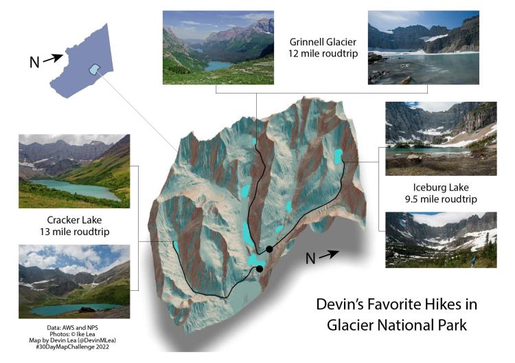
Day 13: 5 Minute Map
Tools Used:
- QGIS, Adobe Illustrator
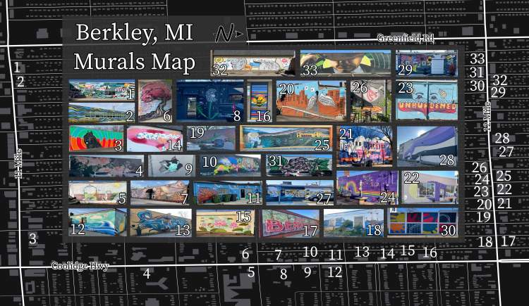
Day 14: Hexagons
Tools Used:
- Adobe Illustrator
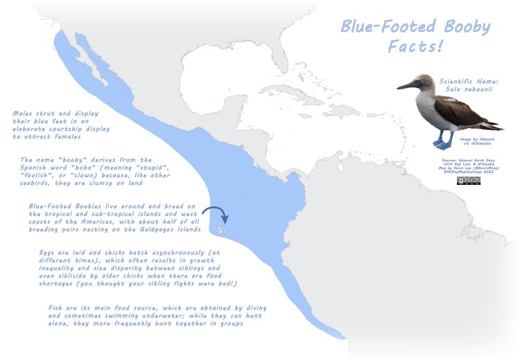
Day 15: Food/Drink
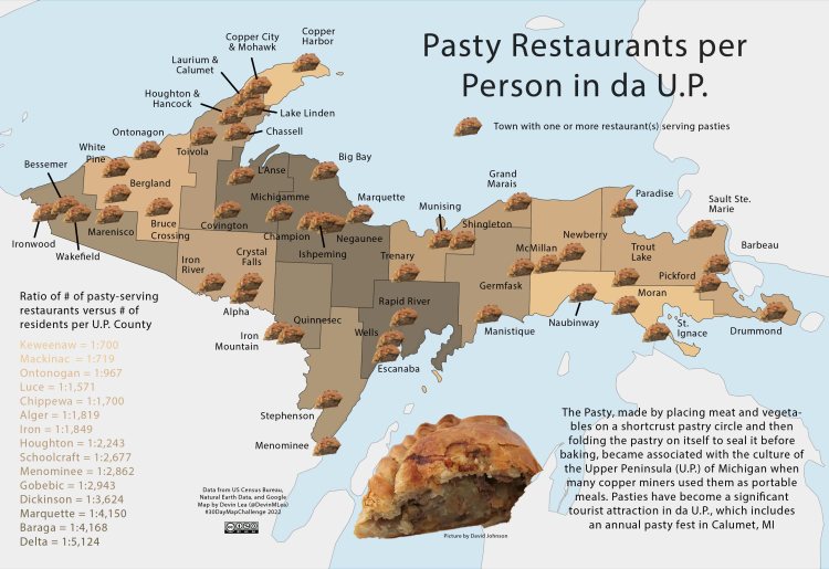
Tools Used:
- Microsoft Excel, Adobe Photoshop + Illustrator, QGIS
Day 16: Minimal
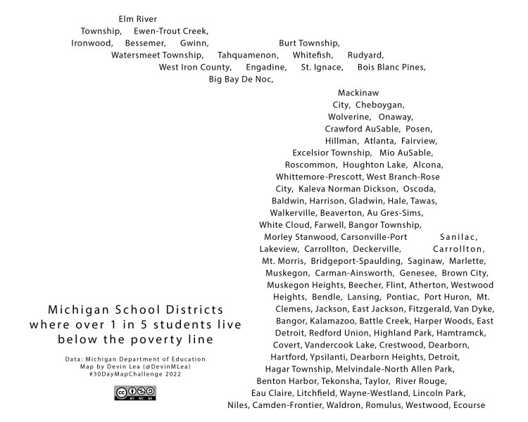
Tools Used:
- Adobe Illustrator
Day 17: Map Without A Computer
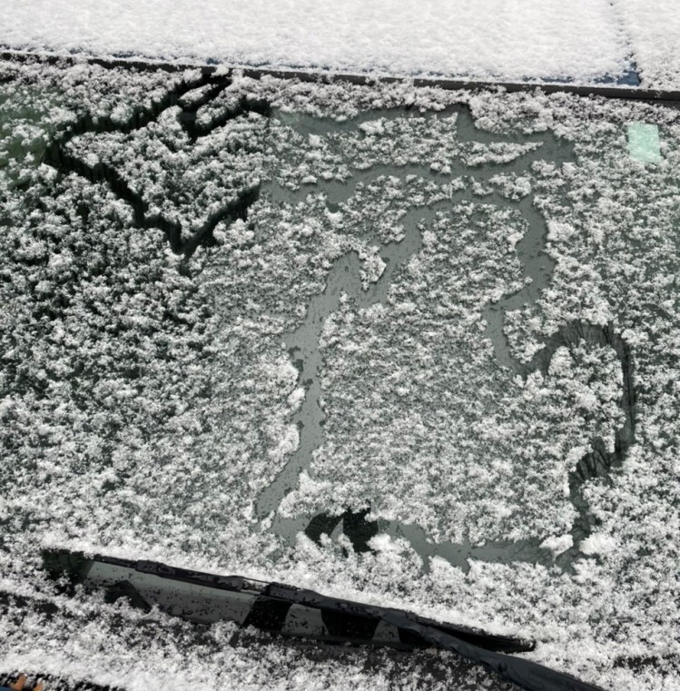
Tools Used:
- Snow
Day 18: Blue
Tools Used:
- QGIS, Adobe Photoshop + Illustrator
Day 19: Globe
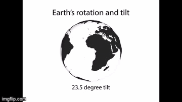
Made this into a .gif via imgflip.com so I could show it here
Tools Used:
- QGIS, Video Editor
Day 20: My Favorite…
Tools Used:
- R, Adobe Illustrator
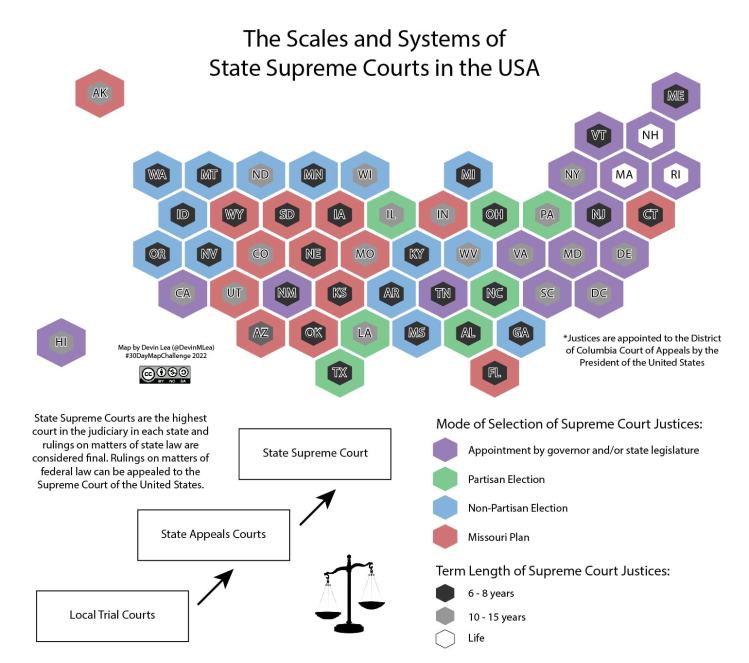
Day 21: Kontur Population Dataset

Tools Used:
- QGIS, Aerialod, Adobe Illustrator
Day 22: NULL
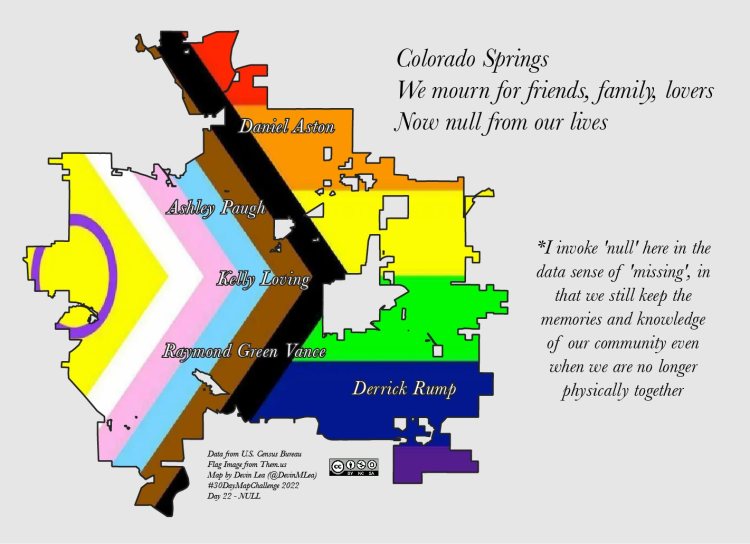
Tools Used:
- QGIS, Adobe Illustrator
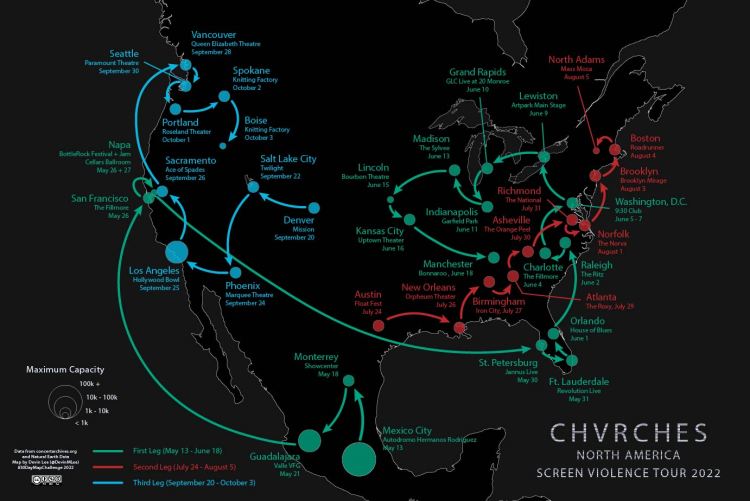
Day 23: Movement
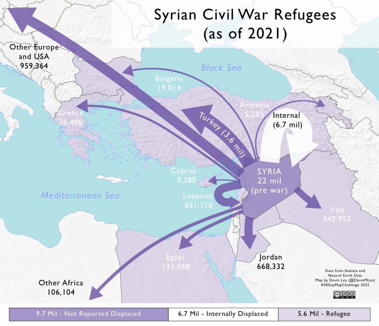
Tools Used:
- QGIS, Adobe Illustrator
Day 24: Fantasy
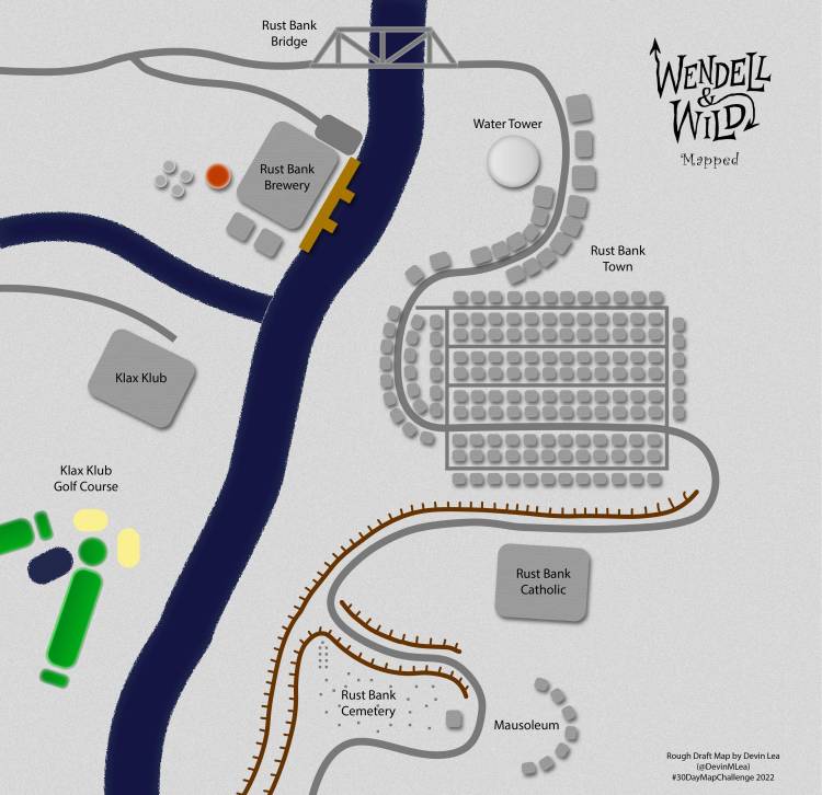
Tools Used:
- Adobe Illustrator
Day 25: 2 Colors
Tools Used:
- QGIS, Adobe Illustrator
Day 26: Island(s)
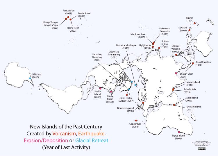
Tools Used:
- Adobe Illustrator
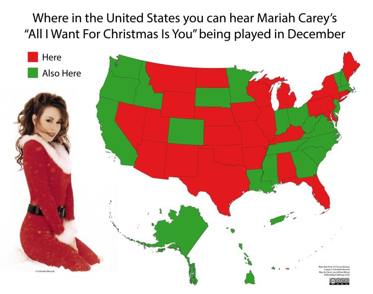
Day 27: Music
Tools Used:
- QGIS, Adobe Illustrator
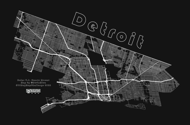
Day 28: 3D
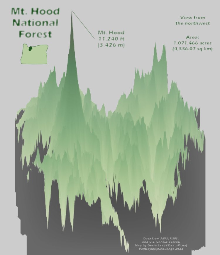
Tools Used:
- R, Adobe Illustrator
Day 29: Out of My Comfort Zone
Tools Used:
- Microsoft Excel, R, Adobe Illustrator
Day 30: Remix
Tools Used:
- Adobe Illustrator (to remix day 5 map)
